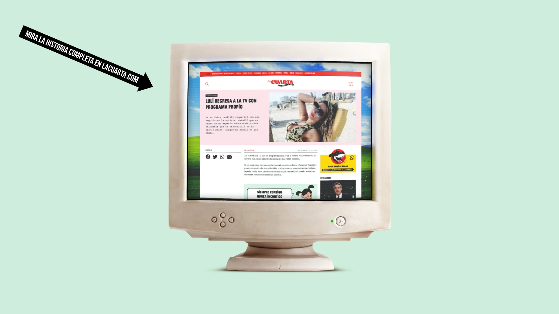
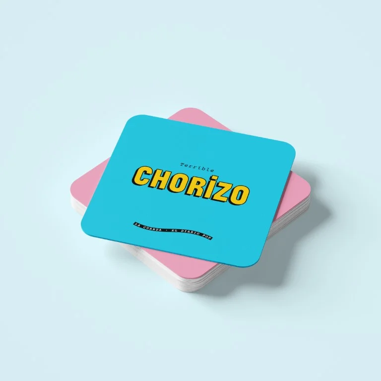
For almost 4 decades, La Cuarta has been the emblematic newspaper of Chilean popular culture, consolidating itself as a relevant artist in the construction of the local collective identity. In 2021 it was redefined to be a completely digital medium, a change in strategy that aims at a more transversal audience that inhabits the internet. This implies the challenge of creating a modern, massive, colloquial, close, deeply Chilean identity and pop above all.
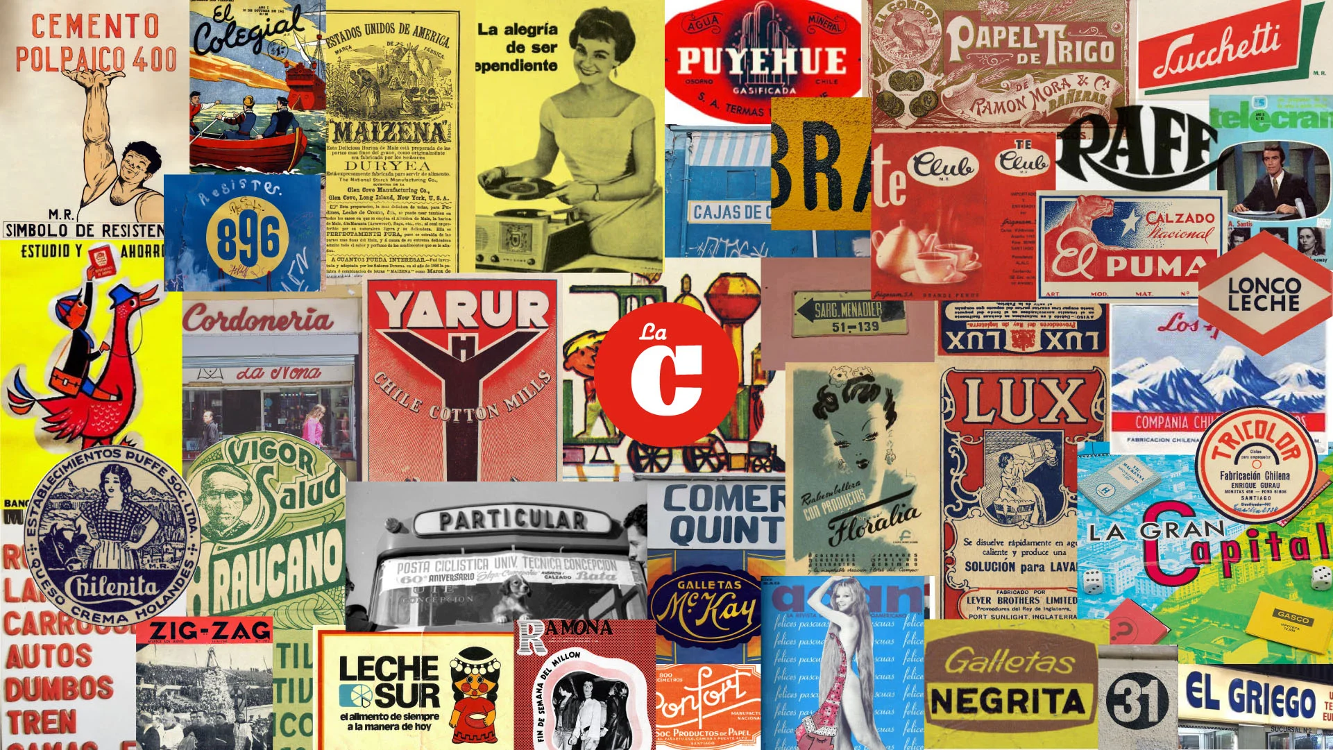
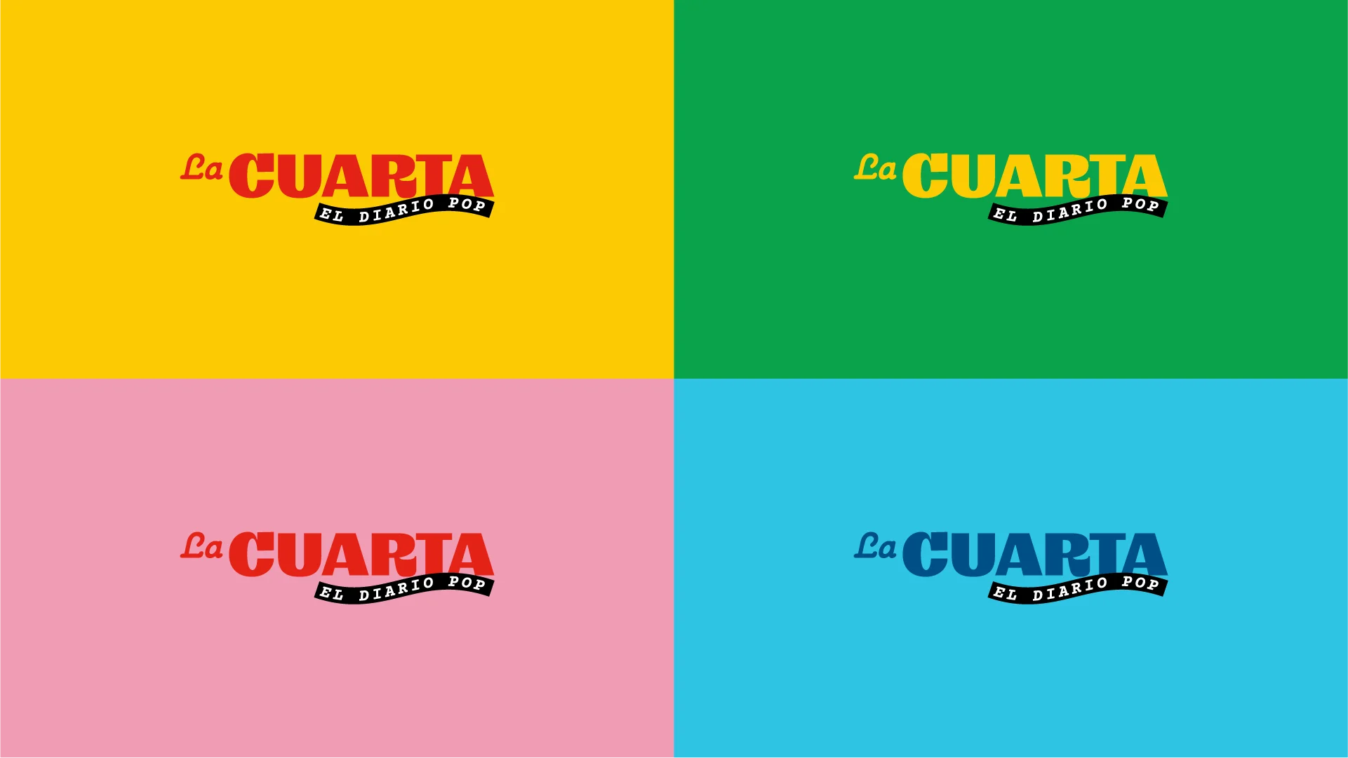
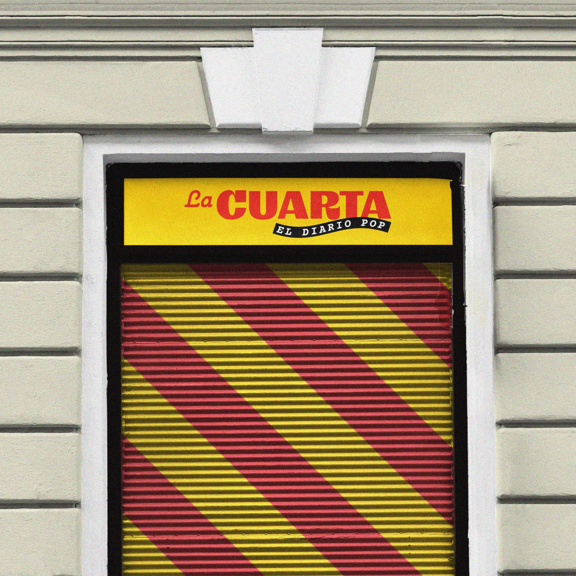
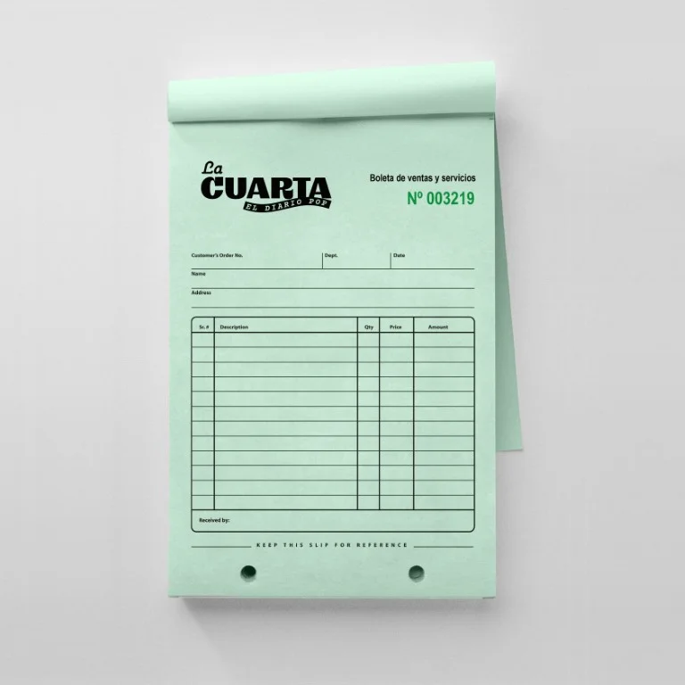
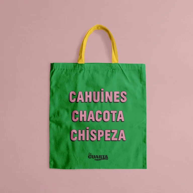
The redesign was an opportunity to connect the tradition of Chilean graphic design with the current and massive public. The logo rescues some elements of its predecessor from 1980, such as the handwritten typeface of "La" and the predominant color red. The use of a very expressive typography with particular strokes is a tribute to local brands that date back to the beginning of the 20th century, framing the identity in something much larger than its own history, it belongs to the history of the entire country and its inhabitants.
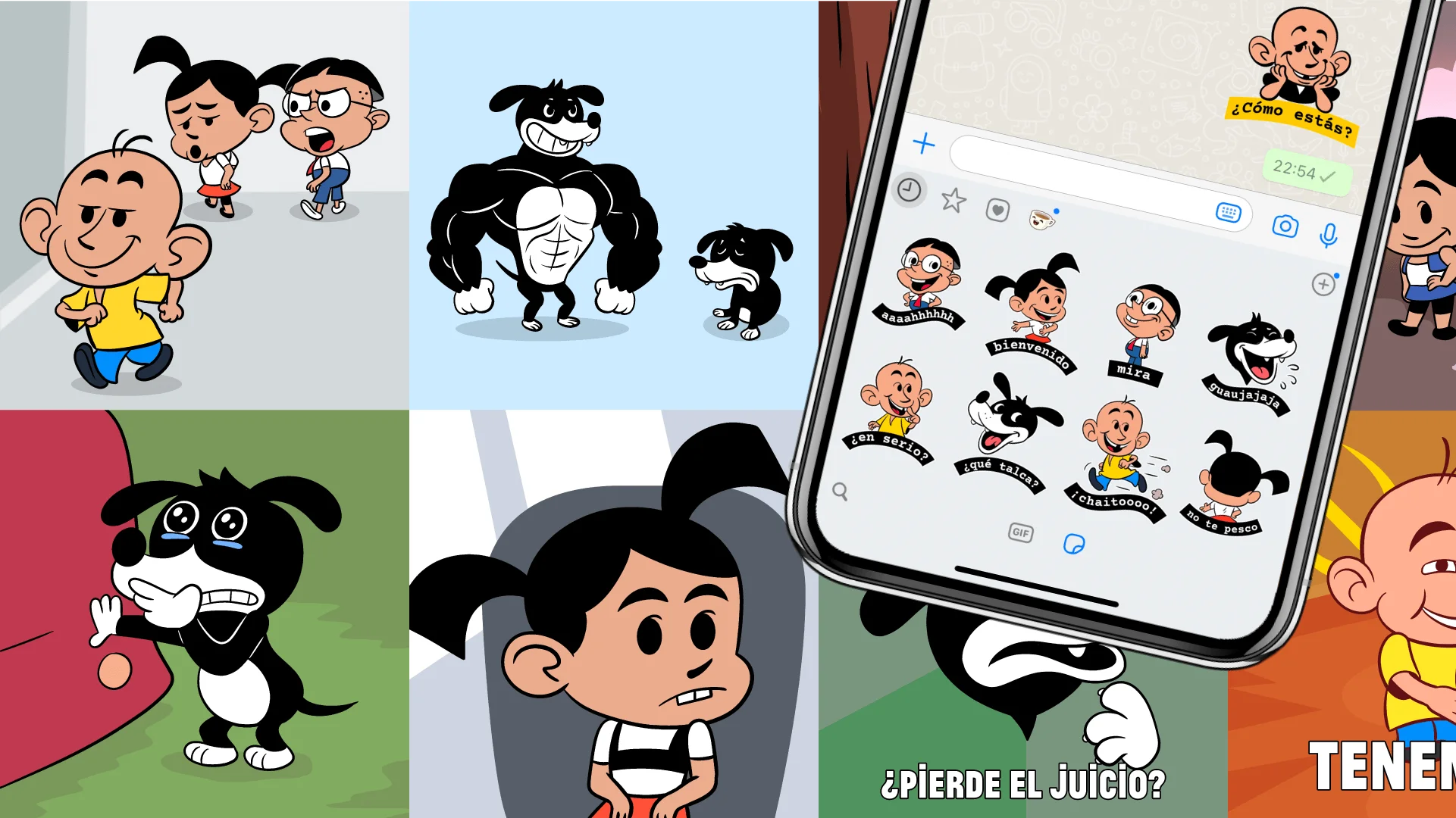
In this way, complementary elements appear that amplify this message: shields, pictures, fonts, ribbons, collages and illustrated characters are complemented in a graphic system that takes care of the mechanics of social networks in a way that is natural to Chilean culture.
